
A collaborative project involving the University of Wisconsin–Madison School of Pharmacy is focused on redesigning prescription labels to improve patient adherence.
By Katie Gerhards
An older patient, who was beginning to experience dementia, also had perpetually restless legs, which would keep her from being able to fall asleep at night. The patient had a prescription for a medication to help quiet that disruptive feeling, but on the label—which read “take two tablets by mouth two to three hours before bed”—all she could see was the number “three.” The patient continually took three tablets.
After speaking with the patient and physician, Nicole Sandberg, a pharmacist at Ballweg Family Pharmacy, decided to rewrite her prescription label to make it clearer for the patient to understand: “Take two tablets by mouth two hours before bed.” With only one number present, the label was easier for the patient to digest, and she was able to manage her medications more easily.
Research shows that this experience is not uncommon, and patients themselves think it’s time for a change. A recent survey of state residents by Wisconsin Health Literacy (WHL), a division of Wisconsin Literacy, Inc., found that 88 percent of respondents found current medication labels confusing, and 23 percent reported having taken a medication incorrectly because of confusing labeling.
The United States Pharmacopeia (USP) in 2013 released a set of standards for patient-centered prescription medication labels, General Chapter 17 in USP’s formulary, which focus on readability and clarity. To date, Utah is the only state to have formally adopted the standards. But a project led by Wisconsin Health Literacy with a range of collaborators, including University of Wisconsin–Madison School of Pharmacy Professor Dr. David Mott, is paving the way to get all Wisconsin pharmacies on board by creating a framework for implementation, which can help out-of-state pharmacies improve their labels, too.
“We want to get as many pharmacy partners as possible to modify their labels using our toolkit or implementation guide,” said Mott. So far, 20 pharmacies have joined to redesign their labels. The project, now in its third phase, has been in progress since 2014 and has already improved patient metrics.
Opportunity to Improve Labels
During early focus groups with the public, “we frequently heard that there is just too much on the label for patients to understand, so they don’t even bother to look,” said Mott. “Because they aren’t looking, they don’t know how to take their medications, and then a lot of times they just end up not taking it at all.”
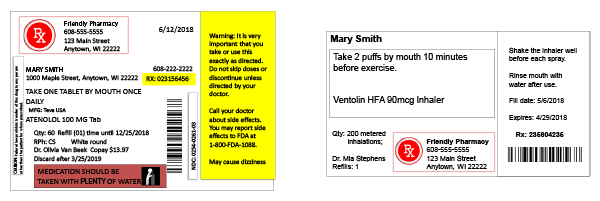
The USP guidelines address a lot of that feedback by suggesting simplified language, in the patient’s preferred language when possible; improved readability through using increased whitespace, contrast and sentence case; and giving explicit instructions, among other standards. Instead of saying “take twice daily,” which leaves a lot of ambiguity—two at once? 12 hours apart?—the labels should say “take one pill in the morning and one pill in the evening,” for example. “Even though the USP guidelines are out there, they haven’t really taken off because what we learned is that pharmacies don’t know how to make these changes,” Mott explained.
Before they jumped into redesigning the label, project leaders wanted to speak with various stakeholders—pharmacists, physicians, software vendors—to assess and account for the barriers. WHL saw that as an opportunity and applied for a grant from the UW–Madison School of Medicine and Public Health’s Wisconsin Partnership Program.
“A really cool part of this project is that a lot of the development and evaluation has actually been by patients,” said Mott. Surveys found that patients didn’t want to see addresses, confusing dates, all capital letters and other clutter, instead preferring a cleaner layout that prioritizes the most critical information at the top of the label and includes a large font, white space, the name of the medicine, what it’s for and the prescriber’s name.
In one focus group, participants had to create their own label out of the disassembled parts typically found on a prescription bottle. Using the USP standards and patient feedback, the participating pharmacies redesigned their labels and put them to the test. In a survey, the results were clear: Only 13 percent preferred the old design. Between the 67 participating sites in phase two, and the approximately 128 additional sites so far in phase three, at least 3.5 million prescriptions already or will soon bear the new, easy-to-understand labels each year.